The Index of Multiple Deprivation (IMD) is the go-to resource when it comes to exploring deprivation across England. It’s widely used by government, the media and charities - and it's used to make funding decisions.
The IMD is the most complete, local-level picture of poverty we have. There are vast amounts of insights we can draw from it, which we’ve explored throughout our deprivation deep dive series.
But like any data set, it's not perfect and it can present a skewed picture, particularly in relation to London. In the last instalment of our IMD deep dive series, we explore areas we need to watch out for.
London's population density and mixed housing make-up
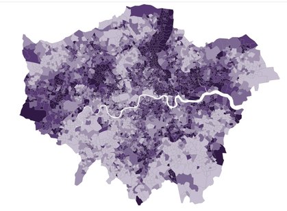
People in London live closer to each other than anywhere else in the country. London’s population density is 5,782 people per km2 – making it on average more than twice as tightly paced as other major English cities.
The result of this is more people from different backgrounds, with different incomes and different types of housing living side by side.
It also means inequality in London is particularly hyperlocal in nature: on the same street, you can find extreme wealth and deep poverty side by side.
Of course, this isn't something new. Charles Booth's poverty maps, produced in the Victorian era and surveying London street by street, show the same pattern playing out more than a century ago.
The image below covers the area just west of Lincoln's Inn Fields: directly across the street from each other sit a section of black, showing the deepest level of poverty, and red, showing the comfortable middle class.
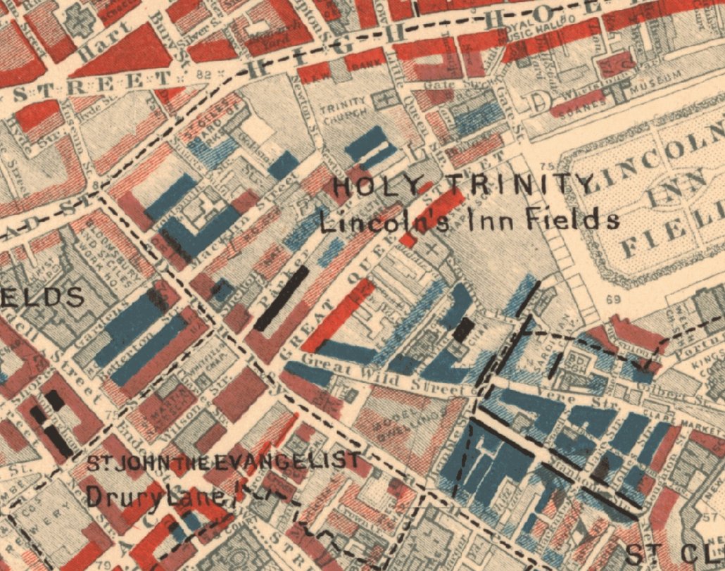
Charles Booth's poverty maps (1886-1903), sourced via LSE
The Second World War intensified London’s hyperlocal poverty patterns. Bomb damage led to widespread rebuilding and new social housing, often placed within otherwise wealthy areas, creating small pockets of deprivation across the city.
These pockets are often so small that even detailed measures like the IMD can miss them: wealthy and deprived streets side by side can average out as “middling” in the data. The IMD also overlooks other important forms of deprivation in London.
Poverty is intrinsically linked to the housing crisis
The most recent poverty statistics from the government show that, after housing costs, London has a higher poverty rate than anywhere else in England.
This has often been the case over the last 20 years. But more so than any other region, poverty in London is driven by the cost of housing. The poverty rate of the city almost doubles when housing costs are factored in.
But the way the IMD is measured underplays this
The IMD is calculated by looking at seven different 'domains' – one of which includes housing. But it doesn’t weight them all equally.
Health and education are both given a larger weighting than housing and barriers to services. London tends to perform better on those two domains – it has significantly better education outcomes than the rest of the country.
On top of this, the housing and barriers to services measure has been criticised by organisations like London Councils because it underplays housing costs and the housing crisis. Distance to a post office, for example, carried the same level of importance as homelessness in previous editions of the IMD - though the latest edition took steps to rectify this.
The impact of these factors is to obscure the true level of deprivation in London. This matters because the IMD is so widely used, including in decisions about where public money and money from charitable foundations goes.
To help add to a more complete picture of deprivation in London, all of our maps are rebased to compare London only to itself.
What this means
It’s important to look at other factors - especially things like unemployment rates, poverty levels and housing affordability indicators – alongside the IMD. And to always remember that the data can’t capture how hyperlocal experiences on the ground truly are, even for a dataset that goes into as much detail as the IMD.
Read the other parts of our deprivation deep dive series: