In this third instalment of our deprivation deep dive looking at the Index of Multiple Deprivation (IMD), we see how deprivation levels have changed (or not) in London's 20% most deprived neighbourhoods.
Before the most recent 2025 publication, the last IMD was published in 2019. This gives us two snapshots of deprivation in London six years apart: one before COVID and one five years after.
The IMD's methodology changes between editions - which means we have to be careful when comparing across time periods. But looking at broad patterns of relative deprivation, as the government's own analysis does, is a useful way to identify emerging trends.
Here we explore what the IMD tells us about the persistence of deprivation across London.
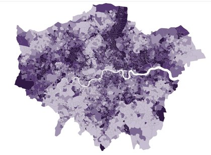
The core geography of deprivation in London hasn’t changed
The map below shows the most deprived 20% of neighbourhoods in London, and how this group has changed between 2019 and 2025.
Red neighbourhoods are those that were in the most deprived group in both years. Green neighbourhoods are no longer in the most deprived group, but were in 2019 - and purple ones are those that are newly in the most deprived group in 2025.
Changes in London's most deprived neighbourhoods (2019-2025)
From a quick glance, we can immediately see that there are more red neighbourhoods than the others.
71% of London’s most deprived neighbourhoods in 2025 were also in the most deprived group in 2019.
In broad terms, the geography of the most extreme deprivation in London hasn’t changed. This is the case for some of the largest clusters of deprivation - such as the band of deprivation in North London we explored in the first part of our deep dive, as well as large parts of East London, Brent and smatterings in South London.
Changes in East and South London
This does mean, however, that around 30% of London's most deprived neighbourhoods are newly in this group, while a further 30% that used to be in it no longer are.
Moving down
The largest cluster of neighbourhoods newly in the most deprived group is in East London, particularly in Newham and Redbridge. There's another cluster in North West London, particularly in Brent and Ealing. Together, these four boroughs account for around a third of all neighbourhoods newly in the most deprived group.
Moving up
The picture for neighbourhoods that have moved out of the most deprived group is different. The largest cluster is also in East London, but in different areas to those that have moved in. This highlights the nuanced nature of poverty and deprivation in London.
Barking & Dagenham has more of these neighbourhoods than any other borough: 36 in total, which is a third of all neighbourhoods in the borough. Hackney also has a large number, at 29.
The other boroughs with the largest number of neighbourhoods no longer in the most deprived group are in South London: Southwark, Lewisham and Lambeth. Together, these three boroughs account for a third of this group.
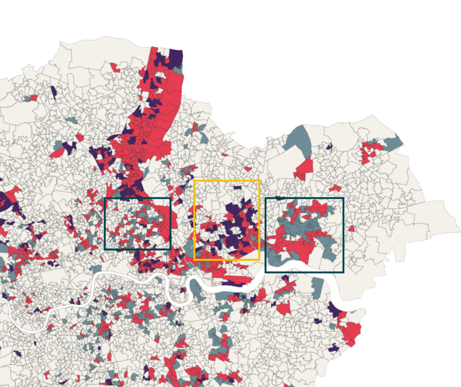
Changing deprivation in East London. Newham & Redbridge have a cluster of neighbourhoods that have moved into the 20% most deprived neighbourhoods - Barking & Dagenham and Hackney have the opposite.
Up next
This blog looked at what has changed in the most deprived neighbourhoods in London. In our next post, we'll zoom out to look at where deprivation has shifted most significantly across the whole of London
Also in this series: