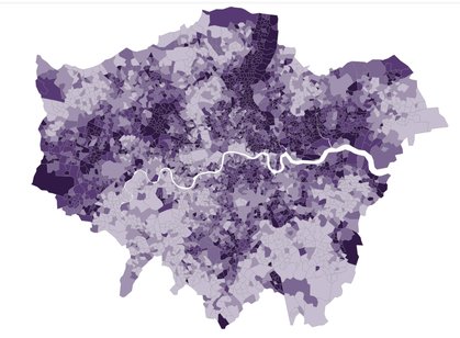
In this first part of our deep-dive series, we look at where London's most deprived neighbourhoods are clustered, using the Index of Multiple Deprivation 2025.
The Index of Multiple Deprivation (IMD) gives us the fullest picture of what deprivation looks like across neighbourhoods in England.
But with so much detail, it can be hard to see the wider trends. In this first part of our deep dive into the IMD, we explore the patterns of deprivation in London.
The IMD gives each neighbourhood in England a deprivation score. So that we can quickly see how deprivation varies across London, we’ve rebased these scores – meaning we’ve excluded the rest of England and re-ranked London’s neighbourhoods against each other.
This gives us a better view of how deprivation is concentrated within the capital, revealing patterns otherwise masked by the national picture.
The map shows that London is a complicated patchwork, with clusters of deprivation across the city. We've highlighted three of the largest clusters.
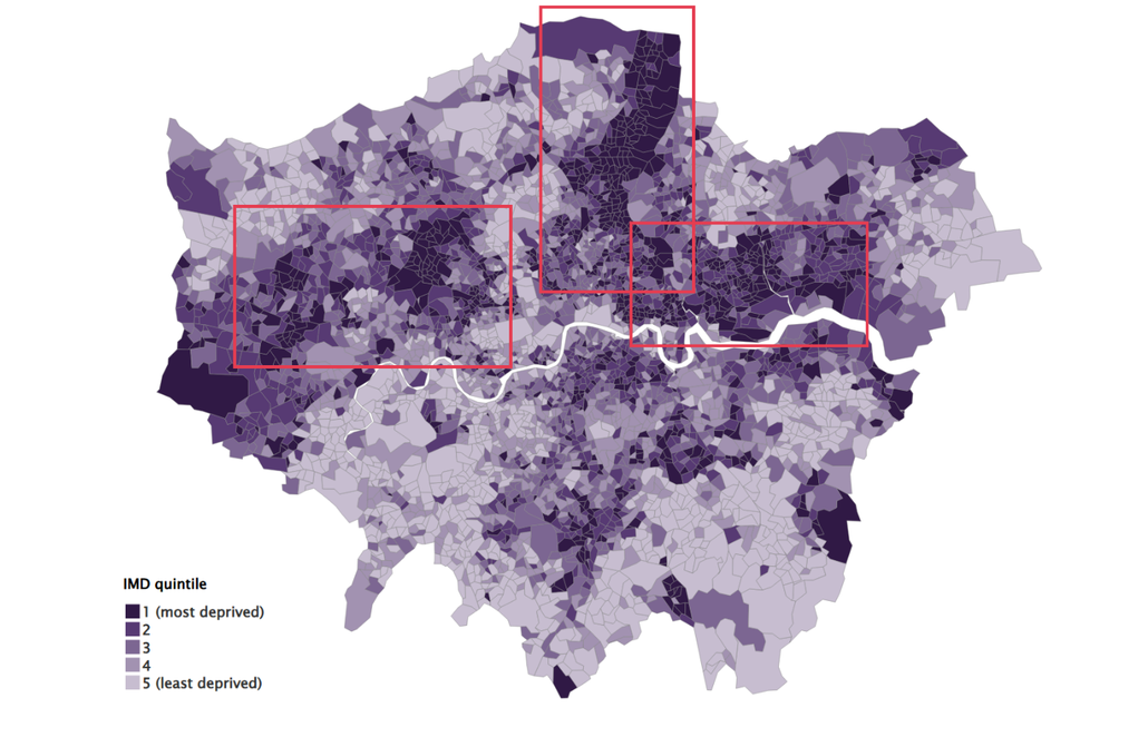
A corridor of deprivation in North London
The largest and clearest cluster forms a band of deprivation through the north of London, roughly mapping onto the Western side of Lea Valley. It stretches from Hackney, through Haringey and the east of Enfield.
Practically every neighbourhood in this region is in the most deprived group.
This stripe of deprivation is especially noticeable because the areas on either side are markedly less deprived: Waltham Forest to the east, and the western halves of Haringey and Enfield to the west.
Swathes of East London
Large parts of East London are also in the most deprived category – especially Newham, Tower Hamlets and Barking and Dagenham.
Barking and Dagenham is the only borough in the whole city without a single neighbourhood in the least deprived 20% of neighbourhoods.
This maps closely onto many of our other indicators, including borough level poverty, unemployment and out of work benefits – where these East London boroughs are most likely to be deprived.
Brent & West London
The other largest clusters of the most deprived neighbourhoods can be found in West London – especially in Brent, with some smaller clusters in Ealing.
But the map also shows that even in areas of the city that appear less deprived, there are pockets of deprivation – such as in parts of Wandsworth and Bromley.
It’s a reminder that deprivation in London can be hyperlocal, with one street often faring very differently to the next.
Read the next part of our deprivation deep dive, exploring what the IMD reveals about four boroughs with lower poverty rates.
Also in this series: